(Case study)

Vurky

Packaging · FMCG and household goods
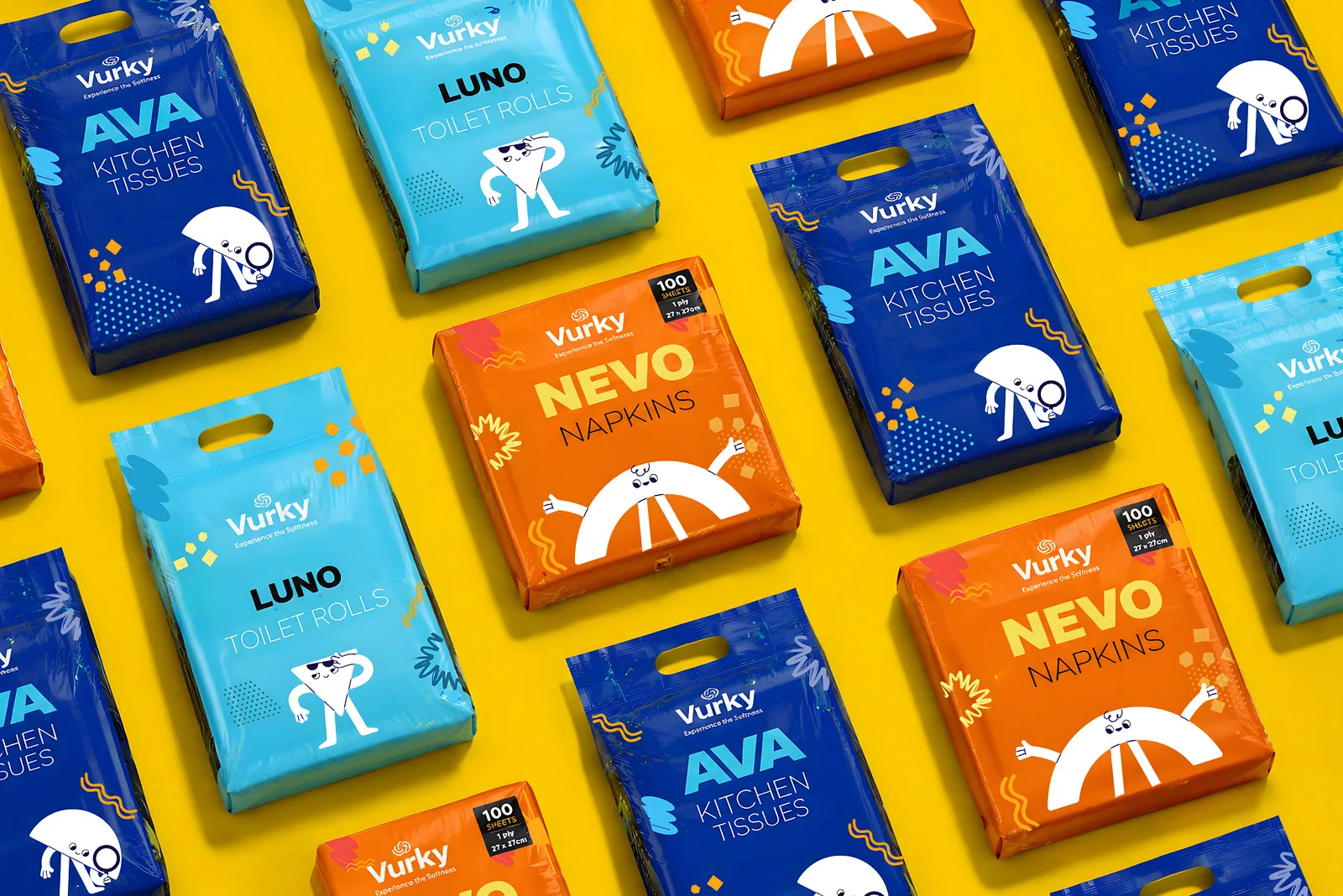
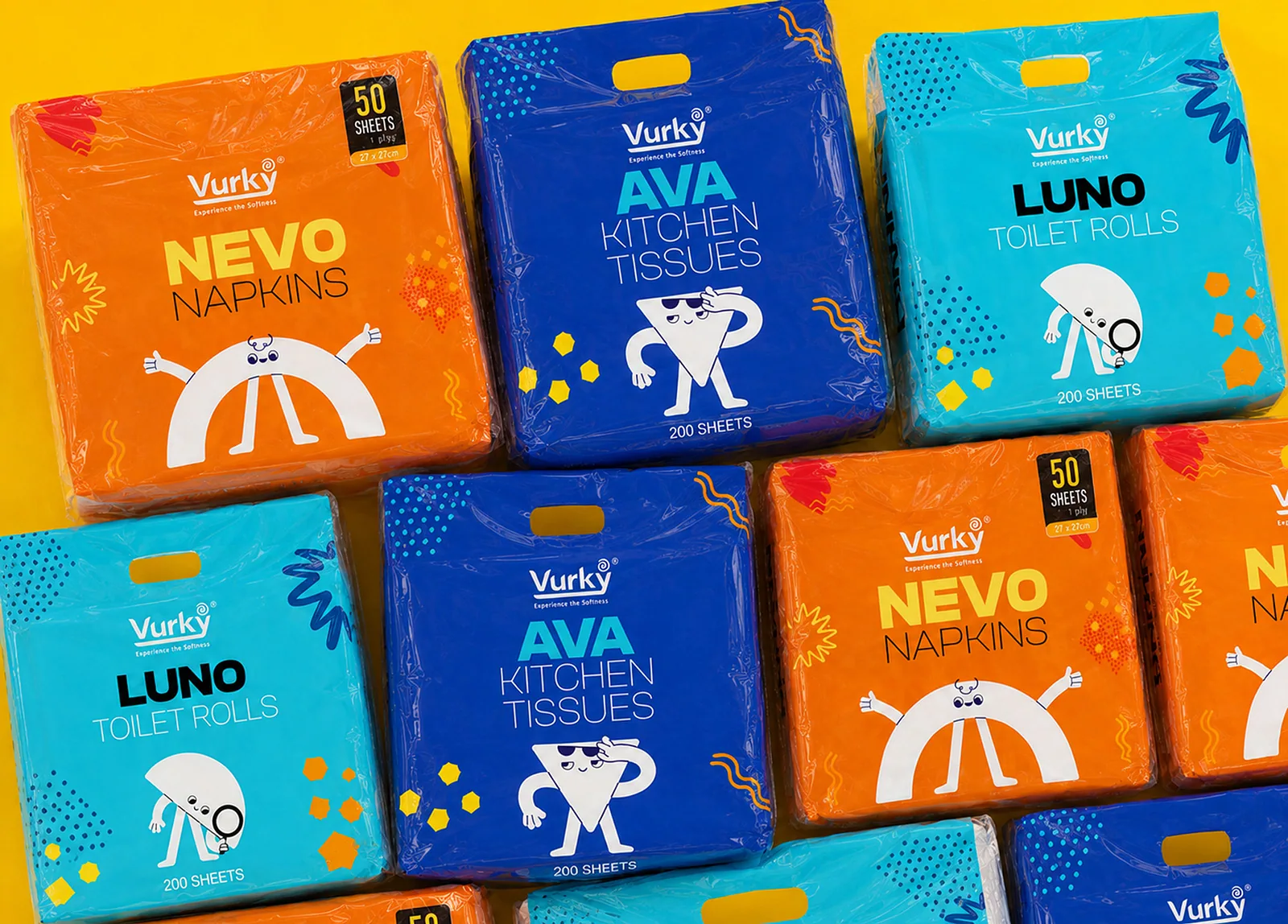
Vurky tissue packs in blue, orange and cyan arranged on yellow
Yellow panel carrying the written project description for Vurky
Nevo, Ava and Luno packs stacked together on a yellow ground

Vurky colour palette with hex codes and the three brand typefaces
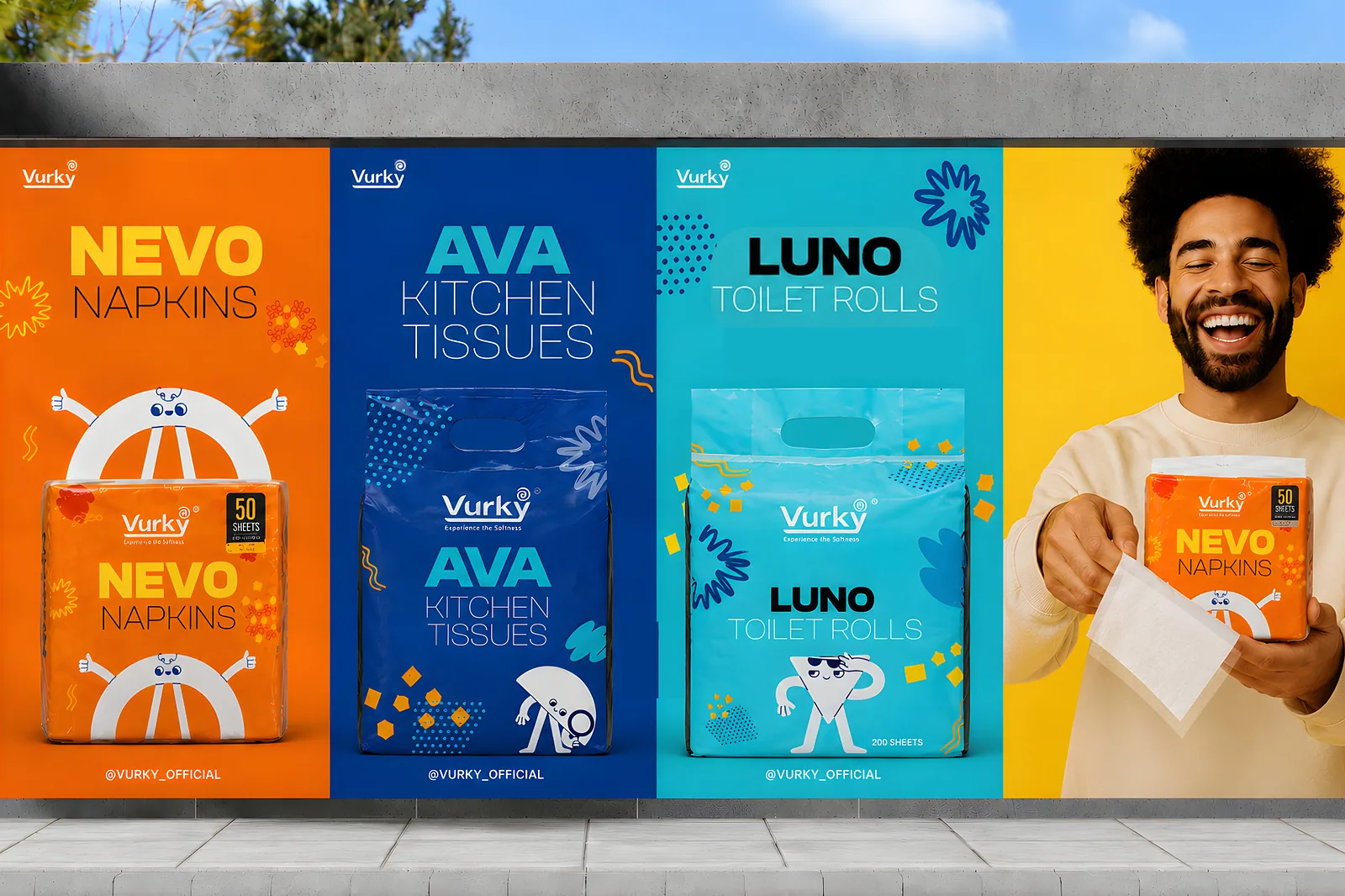
Street wall mural of the Vurky range beside a laughing model

Nevo napkin dieline flat plan beside a Pure Simple Everyday panel

Clean Safe Simple panel beside the Ava kitchen tissue dieline
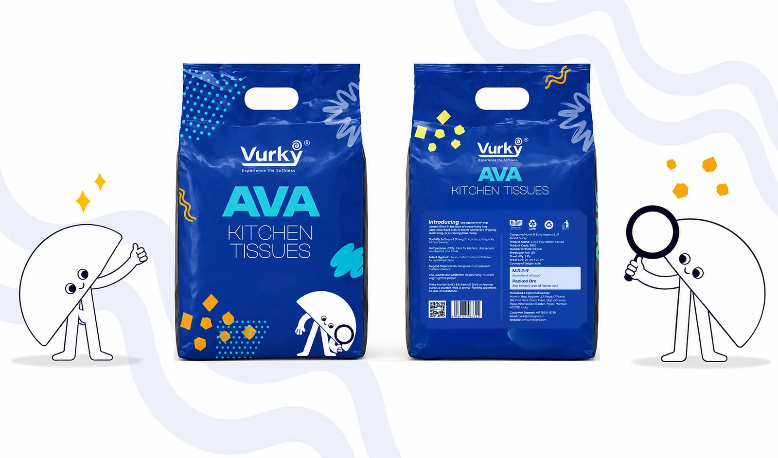
Two Ava kitchen tissue packs with the Vurky characters either side

Luno toilet roll dieline beside a Soft Pure Simple type panel
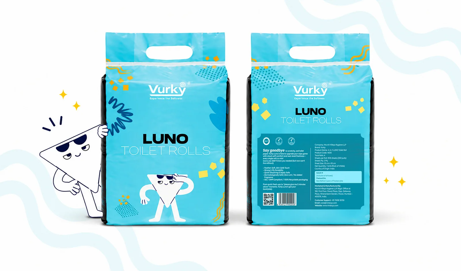
Two Luno toilet roll packs with a character mascot on cyan
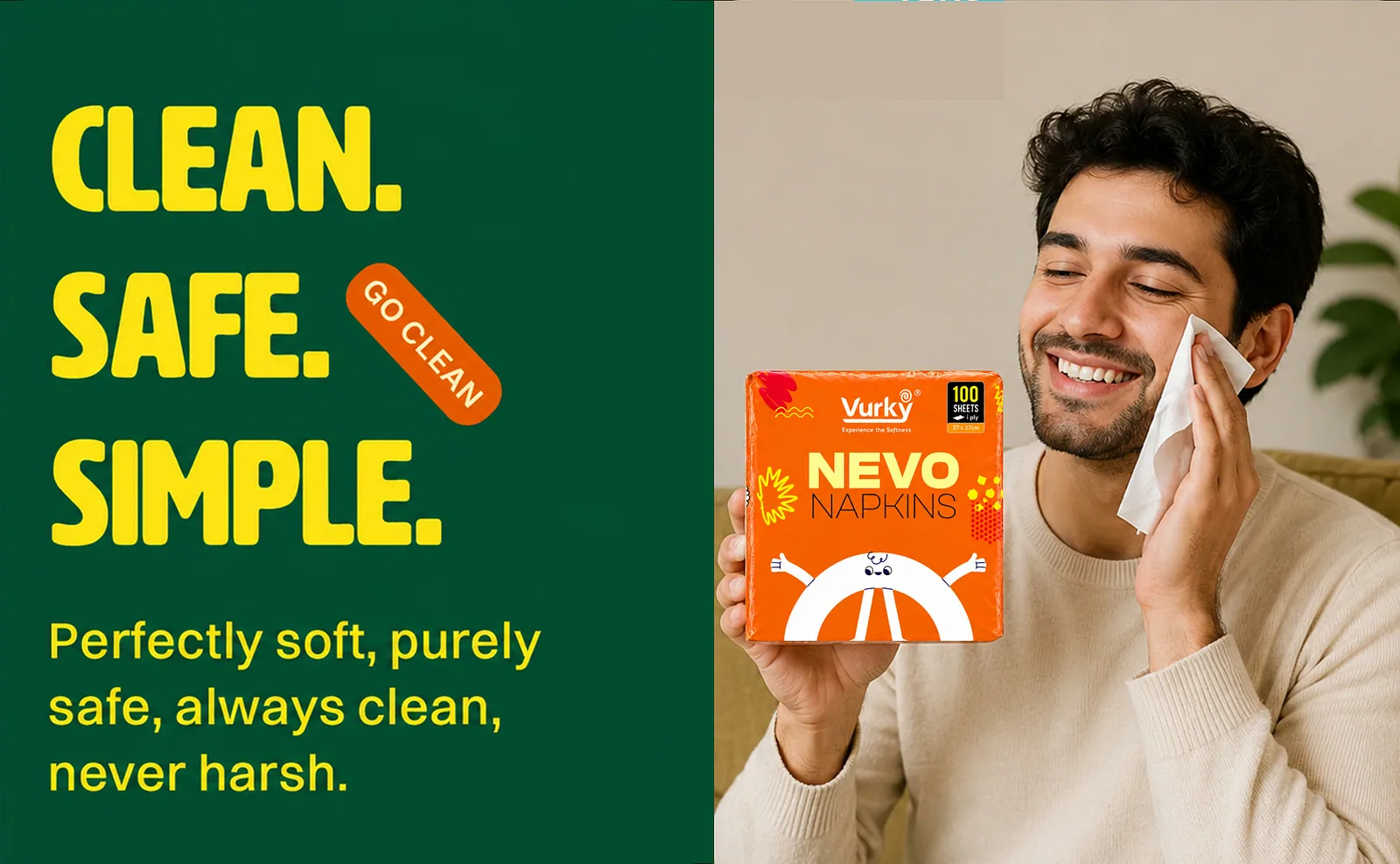
Clean Safe Simple panel beside a man using a Nevo napkin
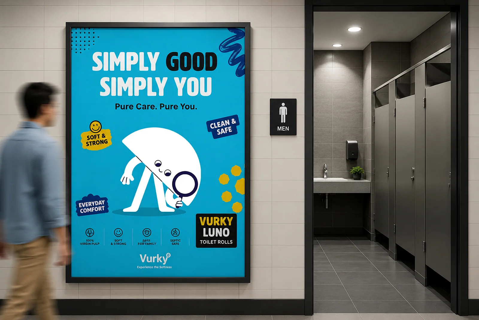
Washroom poster mockup reading Simply Good Simply You
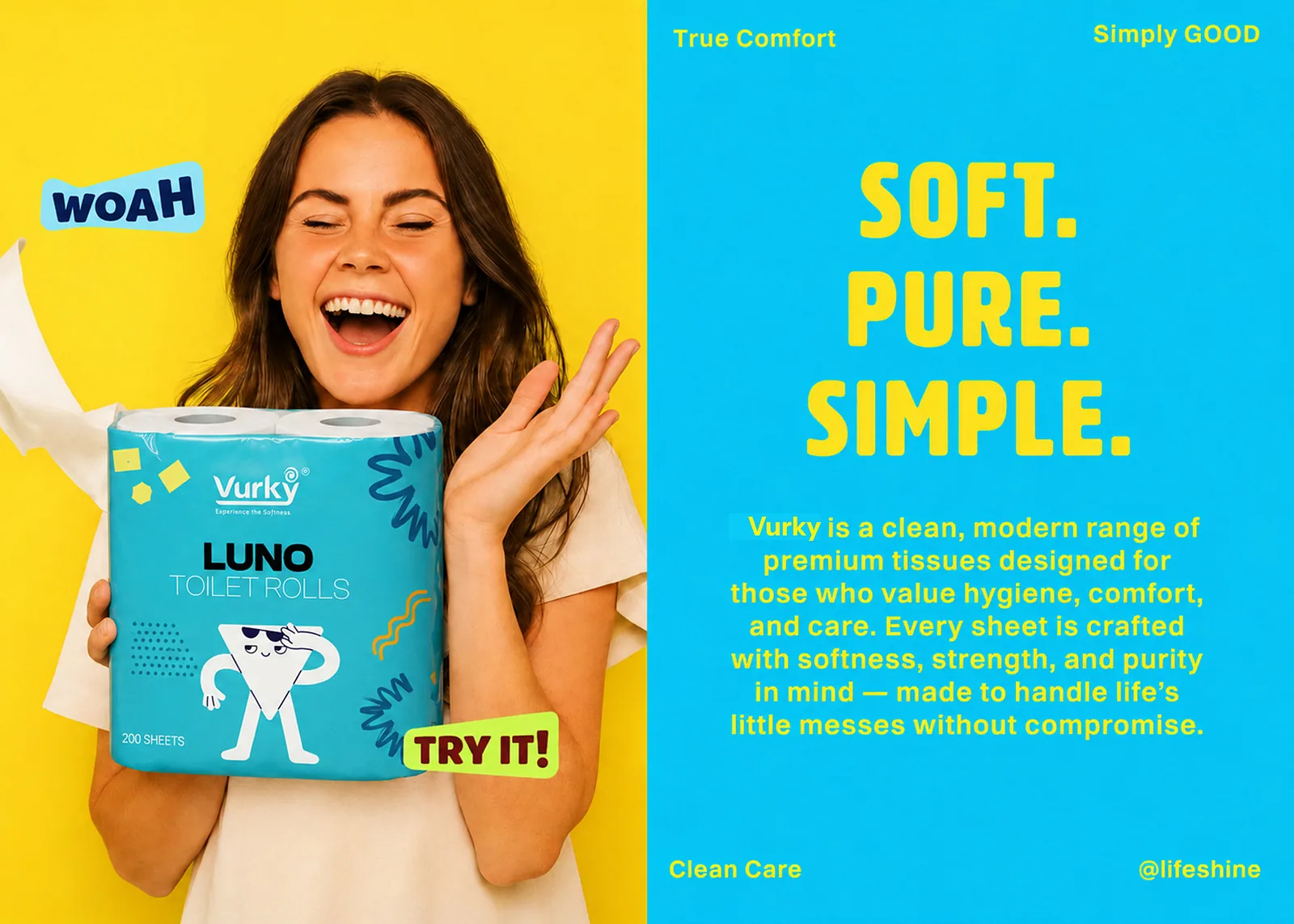
Woman holding a Luno pack beside a Soft Pure Simple panel
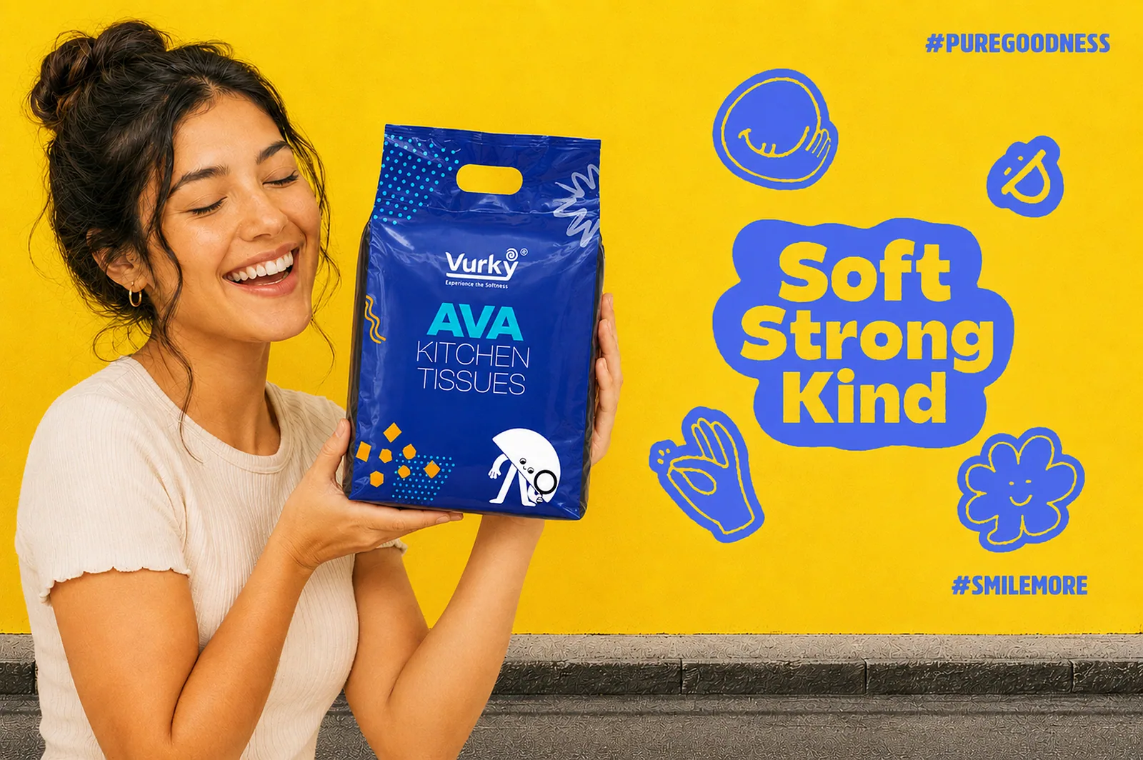
Smiling woman holding a blue Ava tissue pack against a yellow wall
Closing slide with Crafx Studio contact details on black

(About the project)

For Vurky, we transformed product packaging into a powerful brand experience. Through strategic packaging design, refined visual systems, and carefully crafted layouts, we created a premium identity that enhances shelf presence, communicates product quality, and builds a consistent, memorable brand across every customer touchpoint.

What we did
Packaging Design
Label Design
Brand Identity
Art Direction
Sector
FMCG and household goods
Tags
  • Packaging
  • Brand Identity
  • Illustration

(Next project)

Beam