

(Case study)
Cemtac Cements
Branding · Cement and construction materials
(About the project)
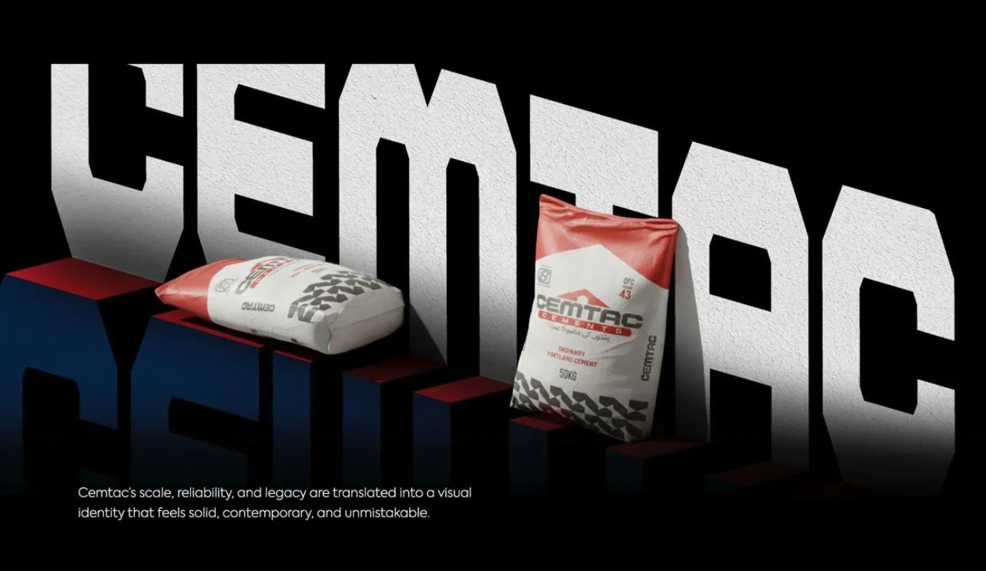
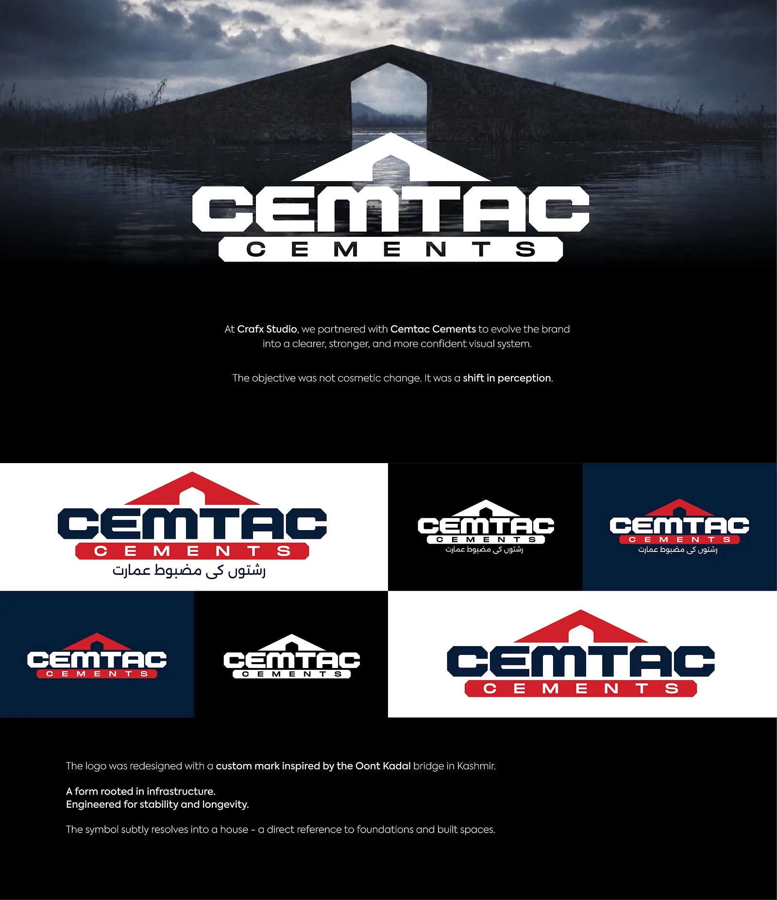
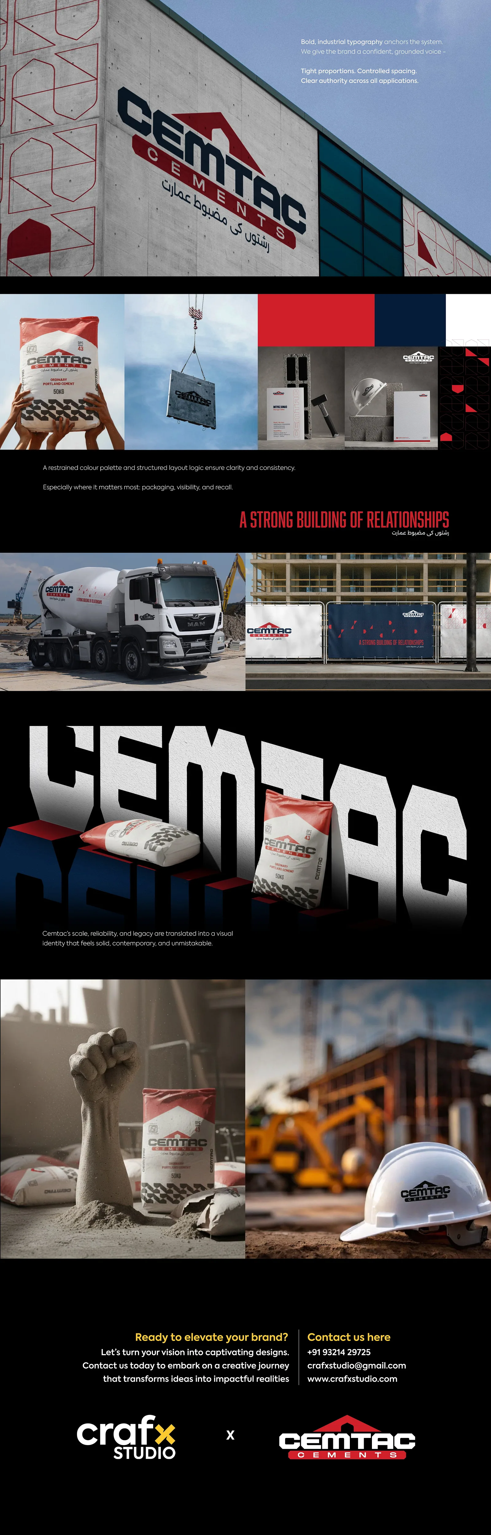
At Crafx Studio, we partnered with Cemtac Cements to evolve the brand into a cleaner, stronger, and more confident visual system. The objective was not cosmetic change. It was a shift in perception. The logo was redesigned with a custom mark inspired by the Dant Kadal bridge in Kashmir, a form rooted in infrastructure and engineered for stability and longevity. The symbol subtly resolves into a house, a direct reference to foundations and built spaces.
- What we did
- Brand IdentityLogo DesignSignageBrand Applications
- Sector
- Cement and construction materials
- Tags
- Brand Identity
- Industrial
(Next project)
Savi Sawara