(Case study)

Beam Skincare

Branding · Beauty and skincare
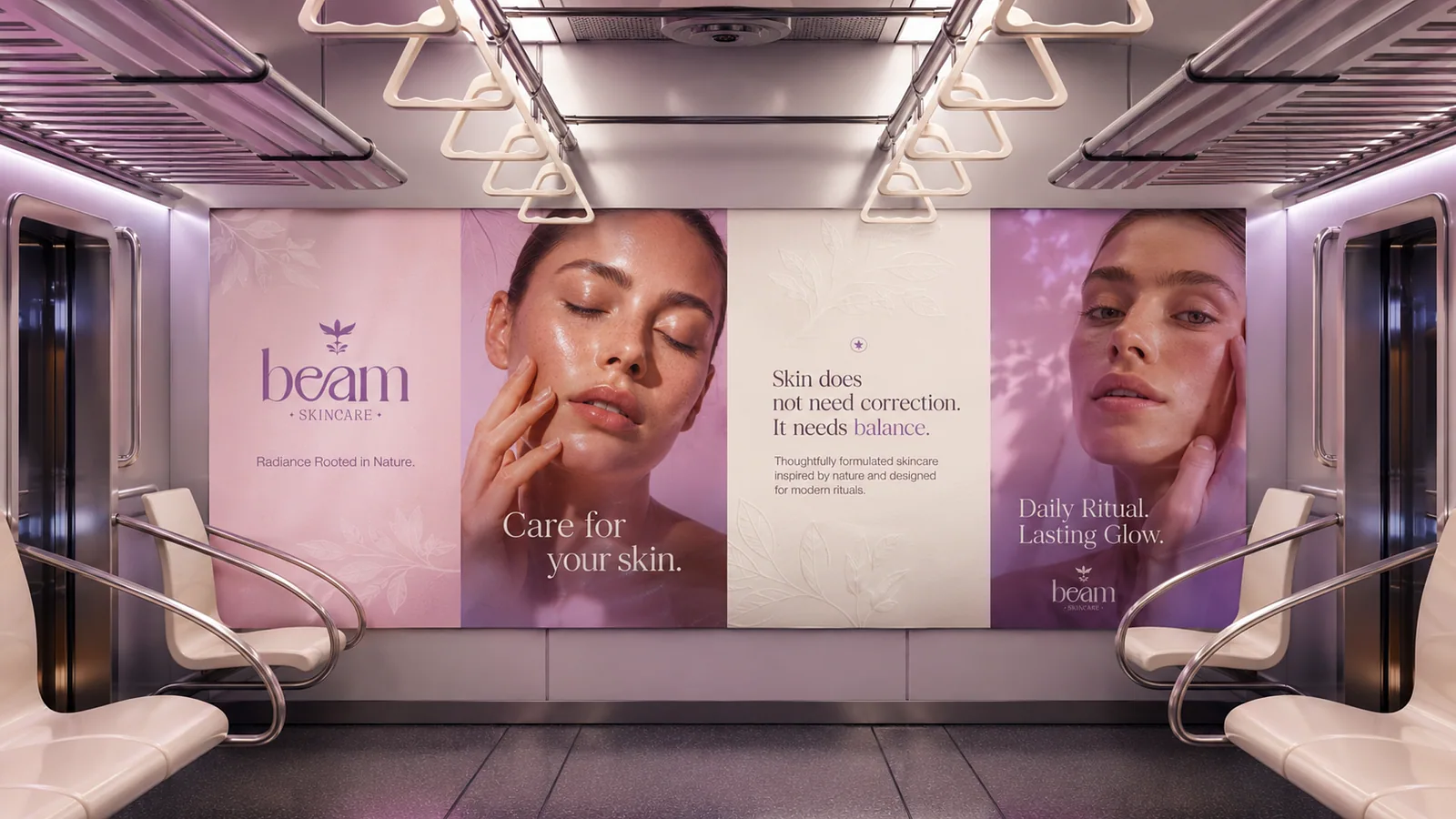
Subway carriage lined with pink Beam skincare advertising panels
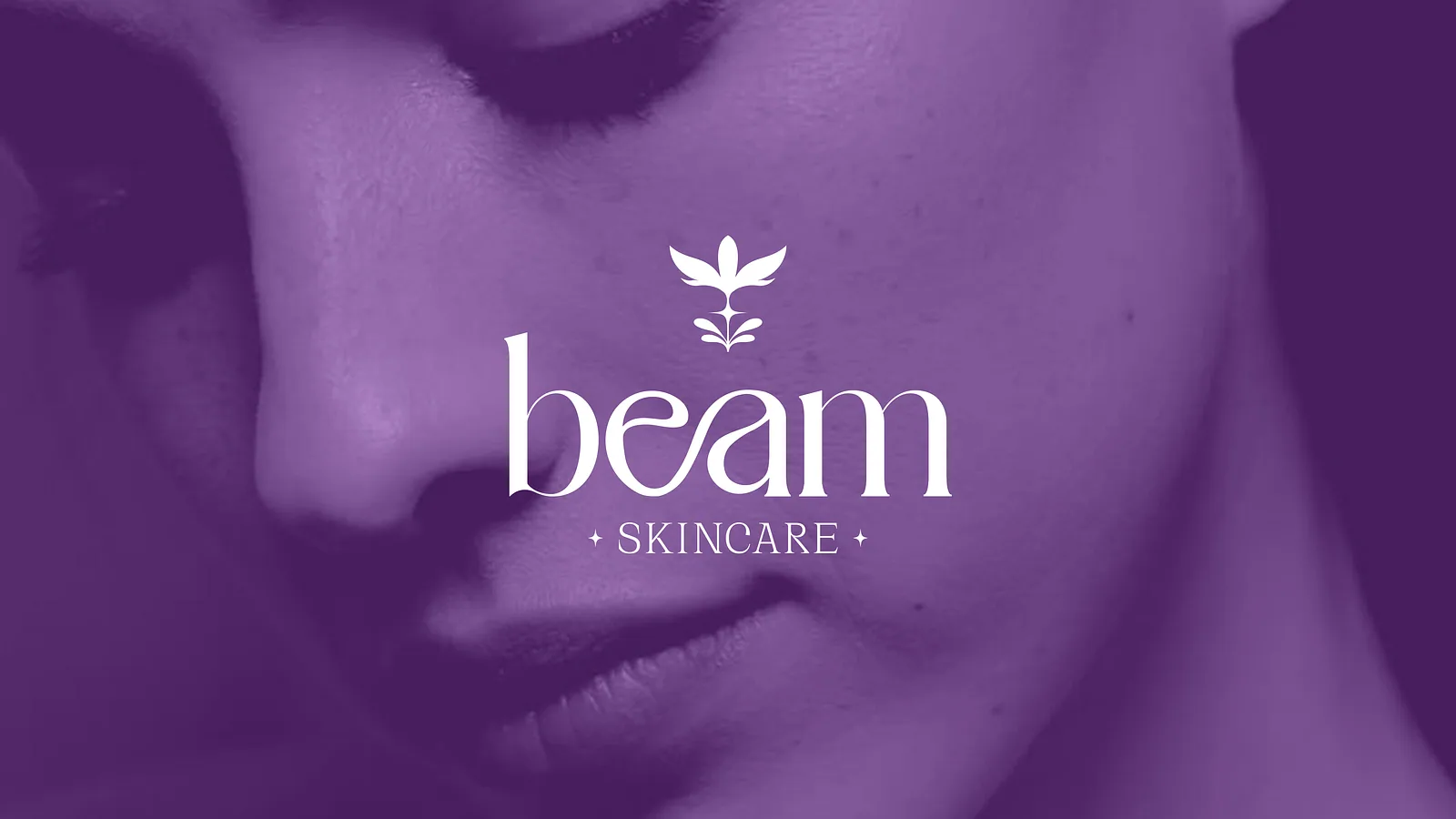
Beam wordmark and leaf symbol over a purple-toned portrait
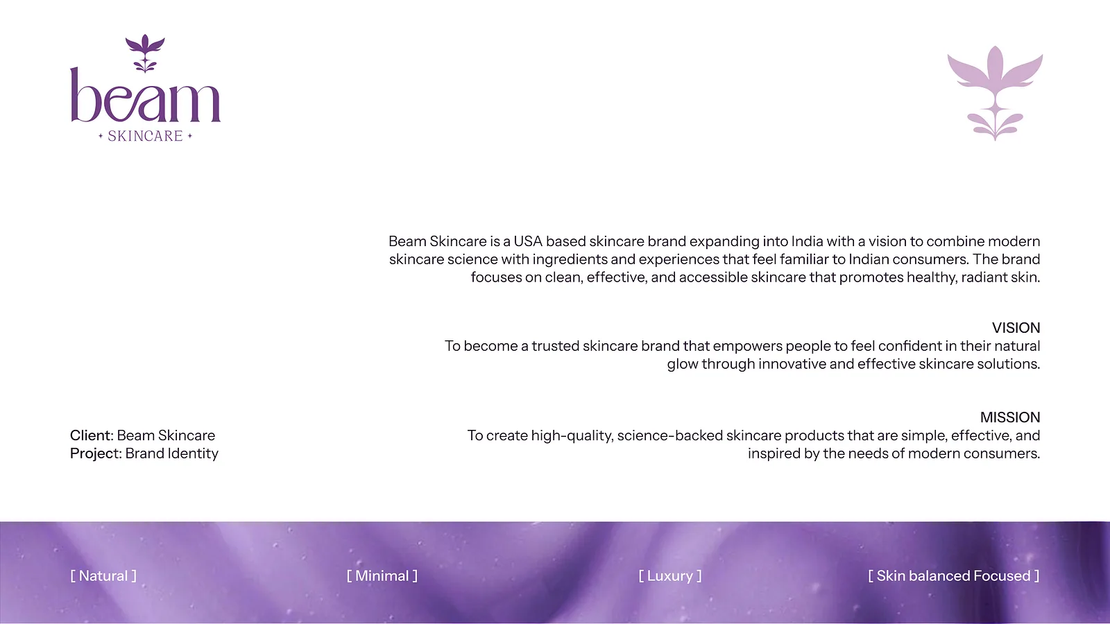
Brand introduction slide with the logo, vision and mission
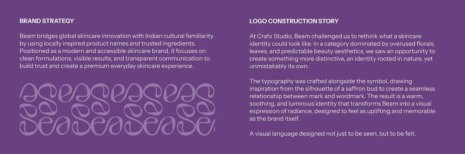
Purple spread covering brand strategy and the logo construction story
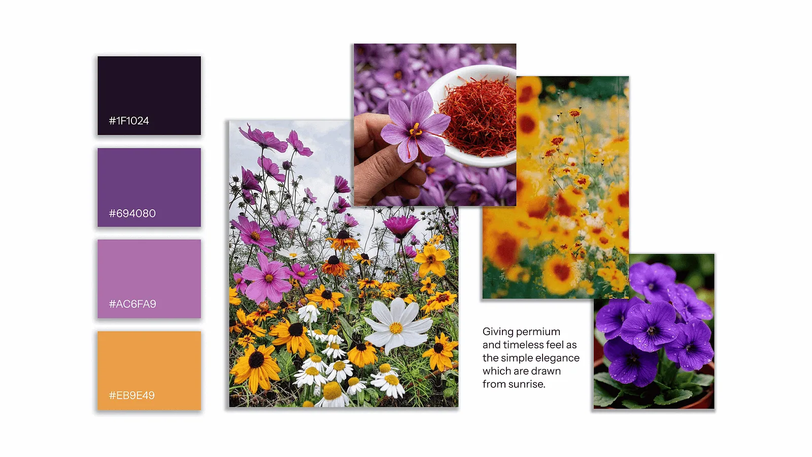
Colour swatches with hex codes beside wildflower and saffron photographs
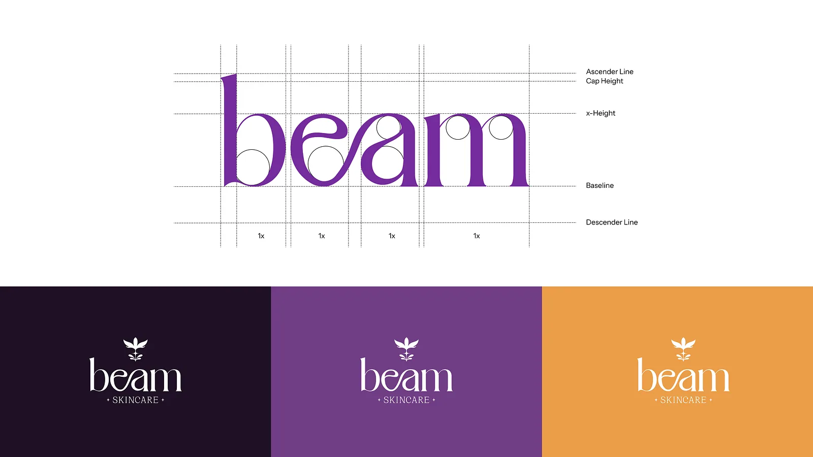
Beam wordmark on a construction grid above three colourway lockups
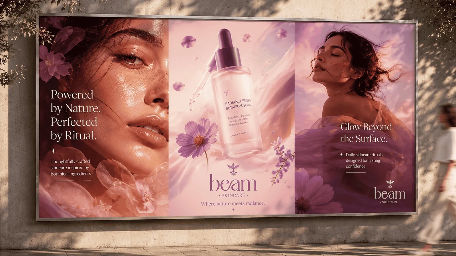
Outdoor billboard triptych with a model, a serum bottle and headlines

App store screen showing Beam app icon colour variants
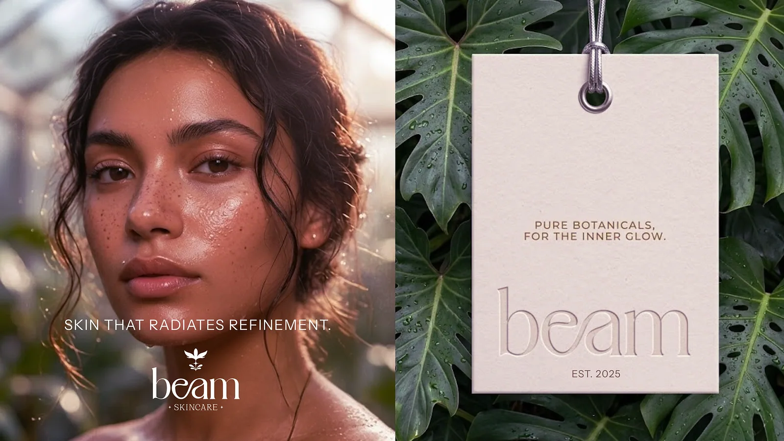
Model portrait beside a cardboard hang tag stamped with the Beam logo
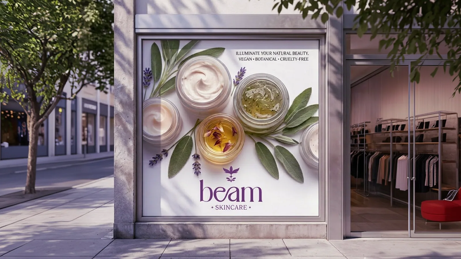
Street lightbox poster of cream jars framed by botanical ingredients
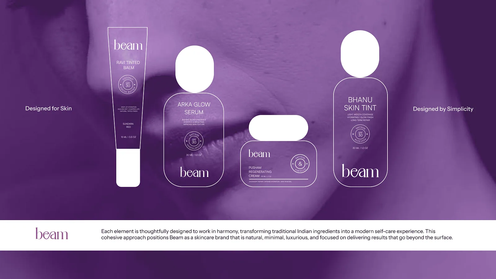
Purple spread of outlined product silhouettes labelled designed for skin
Closing slide with Crafx Studio contact details on navy

(About the project)

Beam is a skincare brand identity project focused on creating a modern, clean, and memorable visual presence. The scope included logo design, visual identity development, typography, color systems, and brand applications. The identity was designed to reflect trust, simplicity, and premium quality while providing a scalable foundation for future packaging, marketing, and digital communication. The result is a cohesive brand system that helps Beam stand out in the competitive skincare market.

What we did
Logo Design
Monogram Logo
Brand Identity
Brand Guidelines
Sector
Beauty and skincare
Tags
  • Brand Identity
  • Logo Design

(Next project)

Cemtac Cements