(Case study)

WaySure

Branding · Real estate
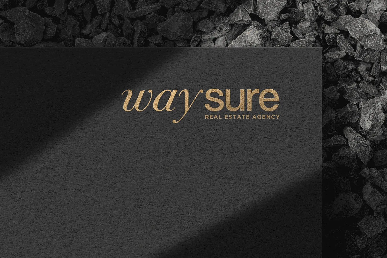
Dark textured card with the gold foil waysure real estate logo
Cream italic serif waysure wordmark centred on a rust background
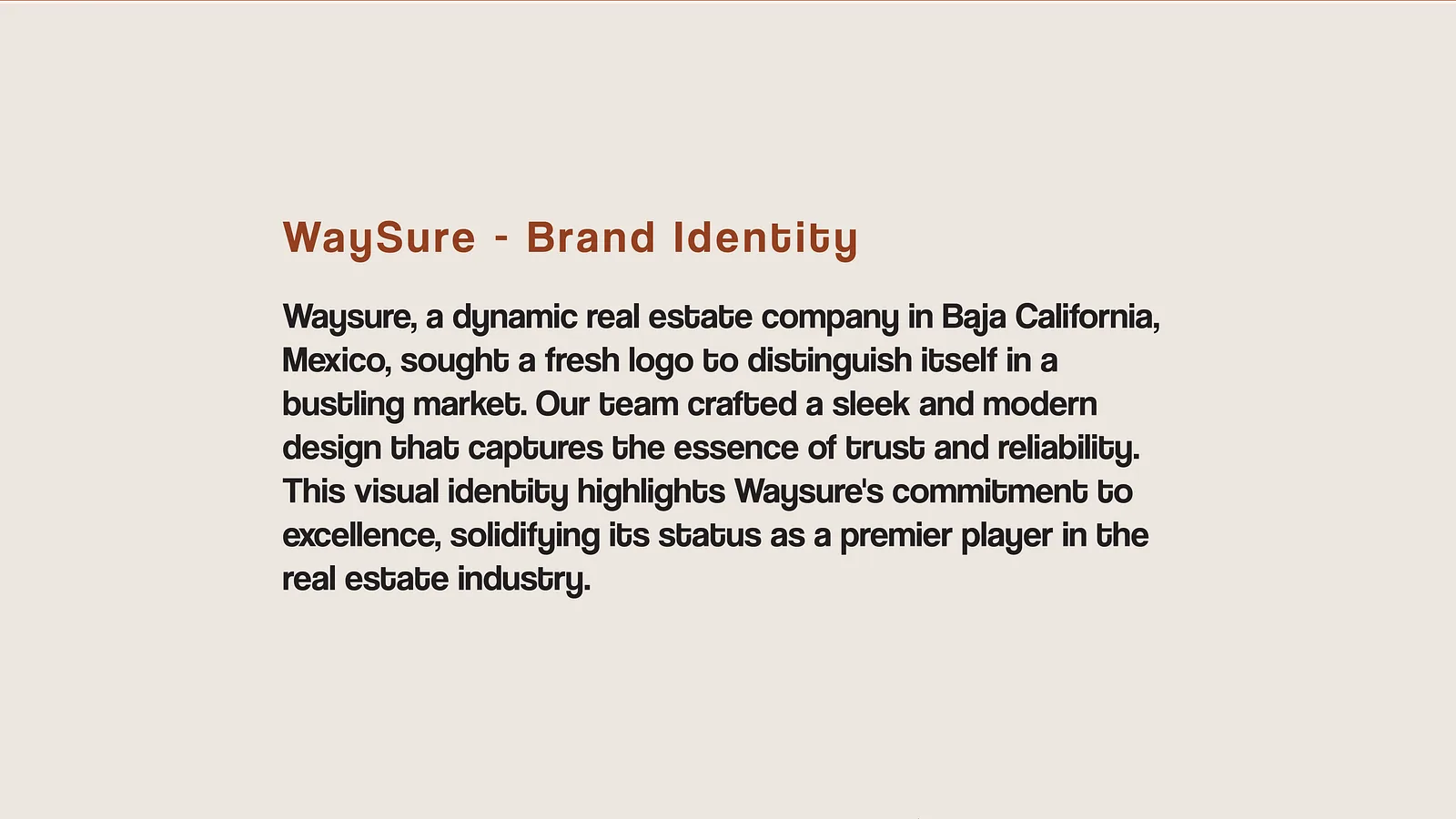
Cream slide carrying the written brand identity description
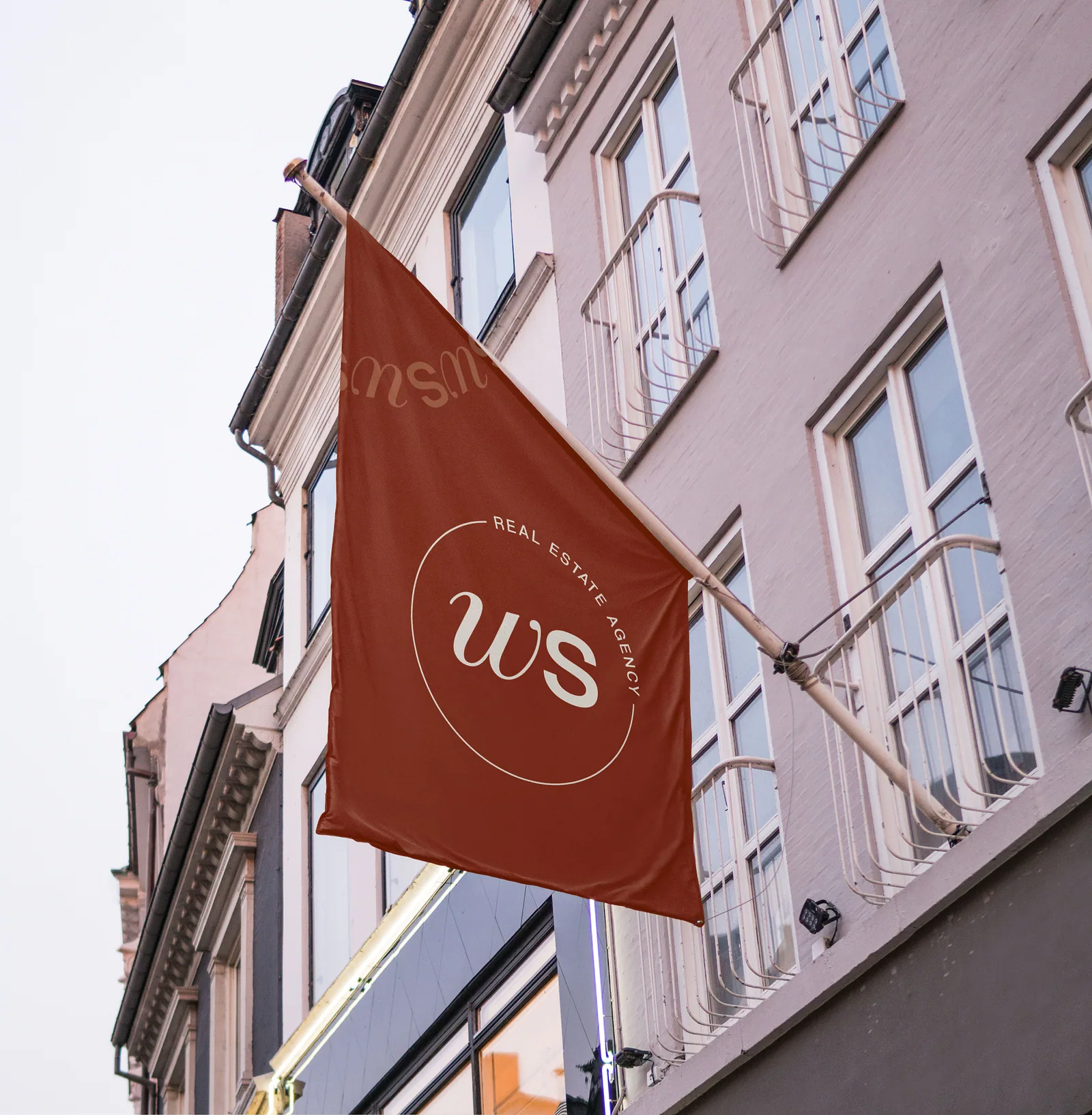
Rust brand flag with a circular WS monogram outside a pink building
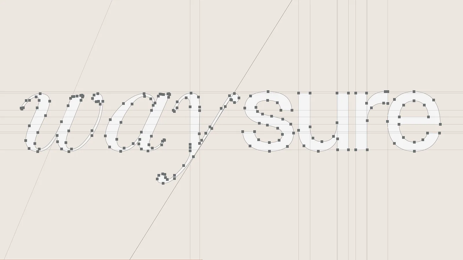
Logotype construction grid showing anchor points and alignment guides
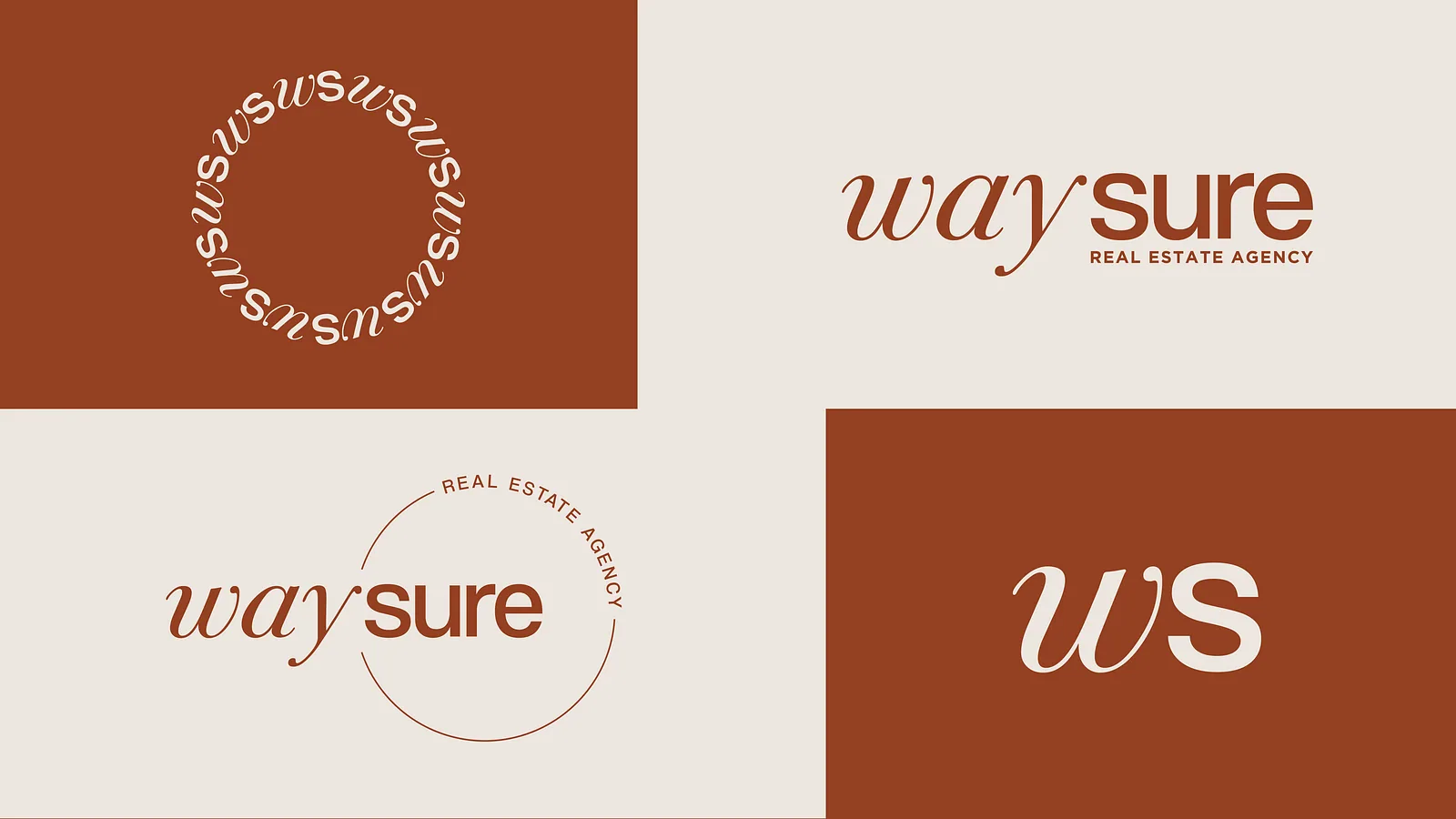
Logo variation set with circular badge, horizontal lockup and WS monogram
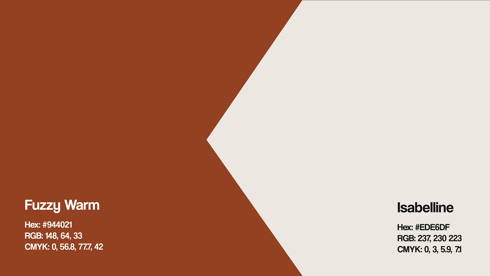
Colour palette slide naming the rust and cream brand colours
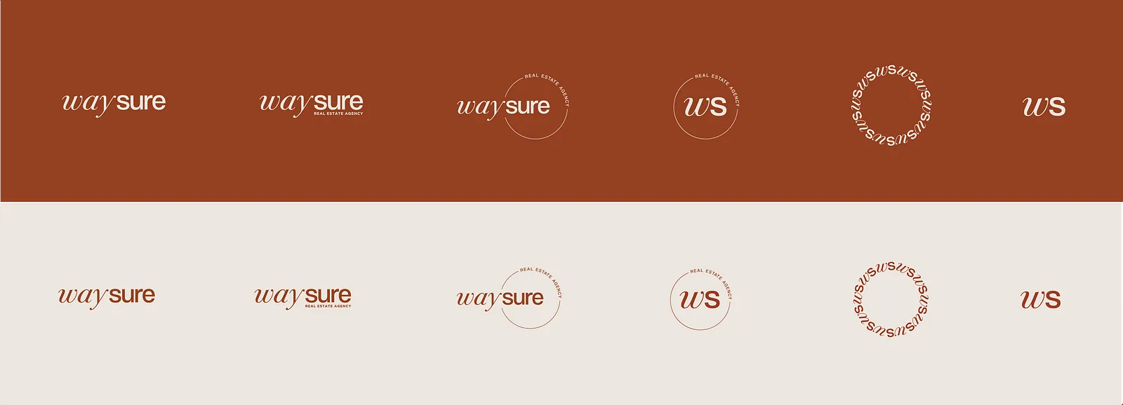
Logo lockup variations arranged across rust and cream bands
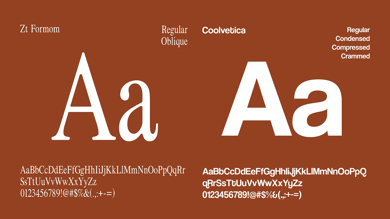
Typography specimen pairing a serif with a sans for the identity
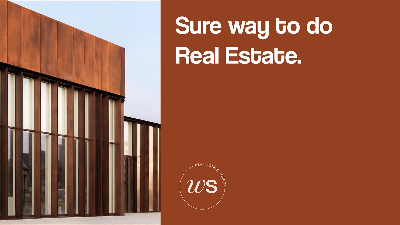
Corten steel building photograph beside the Waysure strapline
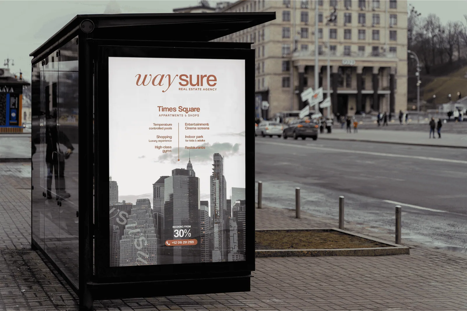
Bus shelter billboard showing a rust waysure property advertisement
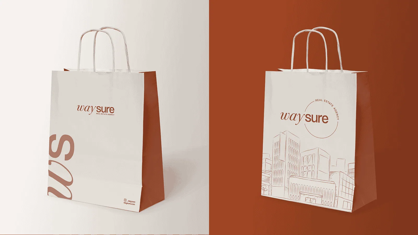
Two paper shopping bag mockups with waysure branding on rust
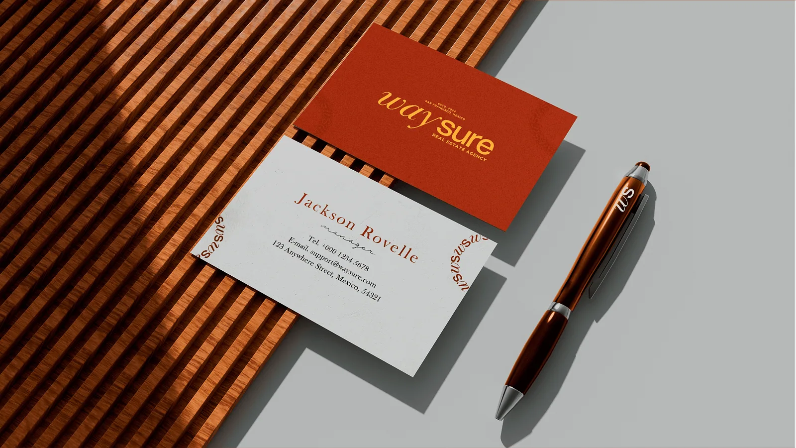
Business card stationery mockup with a pen on slatted wood
Closing slide with Crafx Studio contact details on rust

(About the project)

Waysure, a dynamic real estate company in Baja California, Mexico, sought a fresh logo to distinguish itself in a bustling market. Our team crafted a sleek and modern design that captures the essence of trust and reliability. The mark holds up across signage, print and screen, which is what a property brand needs most.

What we did
Brand Identity
Logo Design
Typography
Outdoor Advertising
Sector
Real estate
Tags
  • Brand Identity
  • Logo Design

(Next project)

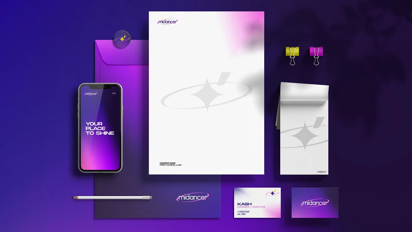
MiDancer Stationery